
Genotype Comparison Visualization Tool (GCViT)
Written by Dr. Anne V. Brown
- March 25, 2020
![]()
What is GCViT?
GCViT (Genotype Comparison Visualization Tool) is a new interactive tool for whole genome visualization of resequencing or SNP array data. GCViT allows a user to compare two or more accessions and visually identify regions of similarity and difference across the genome. It can be used in a web environment, with pre-loaded genotype files, or as a stand-alone application, with user-supplied genotype data (in the common VCF format). Currently, GCViT instances are available for soybean, peanut, chickpea, and common bean. GCViT extracts the genotype information from the VCF file for the given accessions and notes whether or not the accessions have the same allele call at the SNP position or not. GCViT then produces a GFF file of the data to then be plotted. The figures that are produced can be downloaded as a SVG or PNG and the raw data can also be downloaded as a GFF. The examples shown below use soybean.
What are the uses of GCViT?
GCViT can be used to identify genomic regions that were selected during domestication.
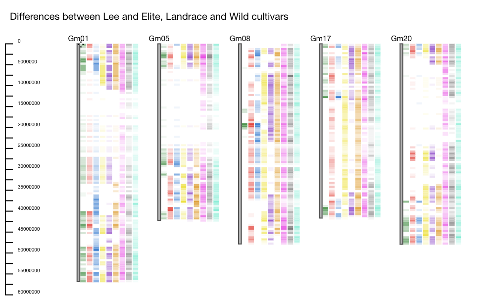
Example: One dataset contains genotype information for a collection of elite, landrace and wild cultivars. In this example Lee, which is an elite soybean cultivar, is used as the reference. Several other accessions including elite, landrace, and wild cultivars are selected to be compared against Lee. The differences between Lee and the accessions are plotted using the heatmap function. We see areas on the chromosomes where there are NO differences between Lee and the other elite and landrace accessions, but differences from the wild (for instance on Gm05 and Gm20). These regions could indicate regions that were selected during the domestication process (Figure 1).
GCViT can be used for pedigree analysis.
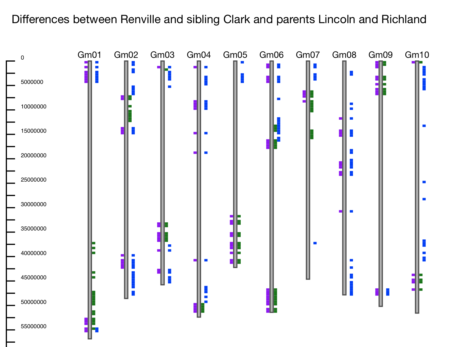
Example: The entire US soybean germplasm collection was genotyped using the SoySNP50K SNP Chip (Song et al. 2015). Differences between parents and siblings are evident. In this example the first 10 chromosomes are shown, using soybean line Renville as the reference, sibling Clark, and parents Richland and Lincoln. Differences between Clark and Renville are plotted on the left-hand side of the chromosome and differences between the parents are plotted on the right. In this example, we can see that where there are differences between Renville and its sibling, there are also differences relative to one of the parents – meaning that Clark inherited this region from one parent while Renville inherited this region from the other (Figure 2).
GCViT can identify regions of introgression.
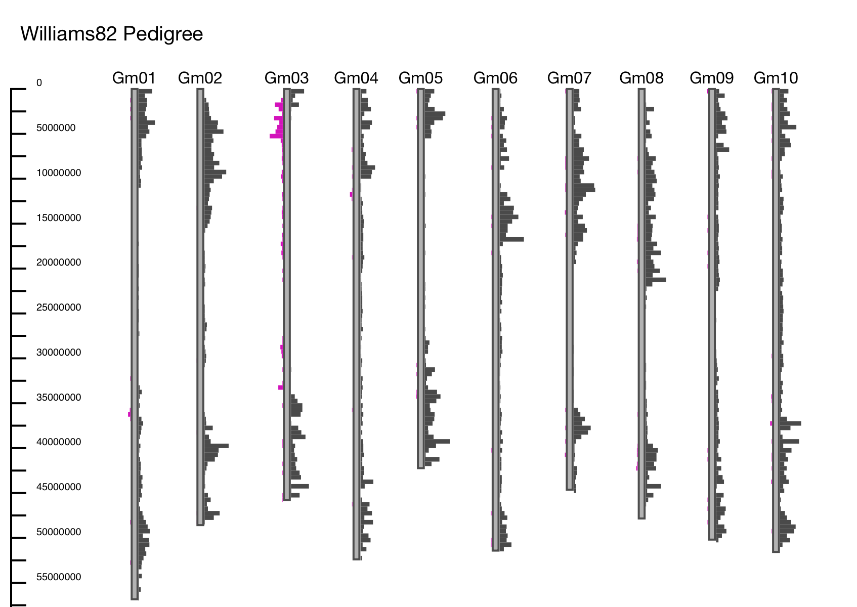
Example: Soybean Cultivar Williams 82 was created by crossing cultivars Williams and Kingwa and using a series of backcrosses to get the Phytophthora resistance gene Rps from accession Kingwa, in a background that is mostly Williams (Bernard et al. 1988). In this example the first 10 chromosomes are shown, using Williams 82 as a reference and displaying differences between its parents Williams and Kingwa (Figure 3). At the top of chromosome 3, is where the Phytophthora resistance genes were introgressed from Kingwa, as this is the only region where there are differences between Williams 82 and Williams, but no differences between Williams 82 and Kingwa.
GCViT can be used as a data validation tool.
Example: If two lines are known to be very similar, but the visual comparison shows a large number of differences between the two lines, this could indicate an error in the data (mis-labeling, error in genotyping, etc.).
Example 2: In a resequencing project, plotting SNP distribution can show if SNPs are evenly dispersed among the chromosomes. Typically, more SNPs should be found on the ends of the chromosomes rather than the middle (as the chromosome ends have a higher concentration of non-repetitive DNA where SNPs can be selected). Large deviations from this pattern may highlight problems in the data.
GCViT Can be used as an exploratory tool to identify genomic regions of interest.
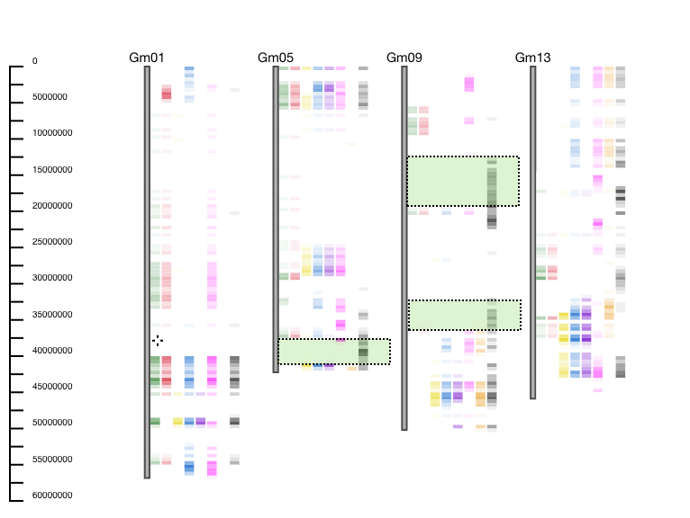
Example: GCViT is used to compare 8 breeding lines to reference accession Hutcheson. GCViT shows that only one accession (last one represented as a black histogram) is different from the reference accession on the bottom of Gm05, and multiple places on Gm09. Users can then ask questions such as: “Why is this line different from the others?”, “What genes fall into this genomic region?”, or “What do these 7 lines have in common with the reference line?” (Figure 4).
How to Use GCViT
A video tutorial for GCViT can be found on YouTube as well as the help documentation at the bottom of the tool.
Once at the GCViT frontpage, first, select a dataset for which we want to compare accessions from. Next, select an accession to use as the reference. Once a reference accesion is selected, the user can now add a comparison.
Once accessions are selected, a user will then move down to the general options, which include title, bin size and ruler. For ease of drawing and computation, each chromosome is broken down into equal sized "bins" across the chromosome. Therefore, bin size is the number of base pairs each bin should contain. The default is 500,000bp.
There are 4 display options: heatmap, histogram, and haplotype which are all displayed in the figures above. Once a display option is selected, a user can then select wether to plot differences, same, or total. Differences will plot the SNPs where there are allele differences between the selected accessions and the reference accessions. Same will plot the SNPs where the selected accession and the reference have the same allele. Finally total will plot the total number of SNPs for the selected accessions. Filter genotypes allows a user to only plot the selected accessions. If only plotting differences between the reference and two other accessions, this allows one accession to be plotted on the left side of the chromosome and the other accession on the right. Min Value is the minimum number of SNPs that need to be present in order for a glyph to be shown (default is 0). Max Value is the maxium number of SNPs for displaying maximum height on the glyph, a provided value of zero will use the maximum value in the dataset (default is 0). Threshold, is specifc to the haplotype display, and is the number of SNPs present in order for a glyph to be plotted (default is 1). The final step is to push the display button.
Interactive Features of GCViT
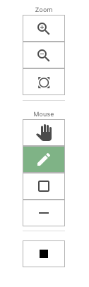
 After hitting the display button, there will be a toolbar to the left of the display (toolbar picture shown to the right). From top to bottom the functions are: zoom in, zoom out or re-center the picture. The “hand” box allows the users to pan the view. The next three boxes are free hand draw, create a box around a certain genomic region, and the eraser tool. The black solid box at the bottom of the tool bar allows the user to change the color of the pencil or boxes.
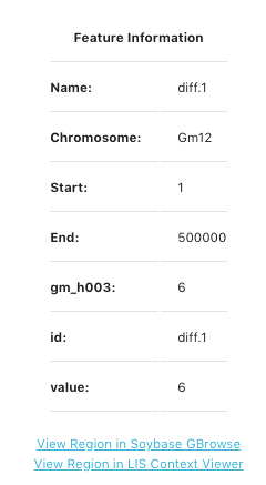
Click on a bin in the display to bring up a pop-up window to reveal feature information about that specific bin. An example of the pop-up box is shows at the left side of the page. This pop-up indicates the bin number under Name, Chromosome, Start and End positions of the speciifc bin, ccession value, id (same as bin name), and the total value of that bin. At the botton of the pop-up screeen are link-outs to see this genomic region displayed on GBrowse and the LIS Context Viewer. The the example to the left, we are looking at Bin #1 on chromosme 12 starting at bp position 1 and ending at 500000 bp. There are a total of 6 values for the accession gm_h003 in bin diff.1 and the total value number for bin diff.1 is 6.
At the bottom of the image is a gray bar titled "View Control" (pictured at the bottom). Clicking this tool bar allows chromosomes to be turned off and on along with the features displayed on the left and right hand sides of the chromosomes. This is useful if a user is only interested in certain chromomes.

GCViT was developed by Andrew Wilkey (ORISE Scholar USDA-ARS, Ames, IA) and Anne V. Brown. It extends CViT-js and CViT (Cannon and Cannon 2011), by Andrew Wilkey, Ethalinda Cannon and Steven Cannon (USDA-ARS, Ames, IA).
For more information on GCViT or if you have any questions, please Contact Us
About the Author

Dr. Anne V. Brown
Research Biologist/ Postdoctoral Scholar
USDA-ARS Ames, IA
Research Interests:
- SNP analysis
- Soybean Genomics
- Stay-Green trait
References
Lambert, J.W. (1964). Registration of 'Renville' Soybean (Ref. No. 45). Crop Science 4(6):664-665